Motion design is an important element of contemporary branding to enhance the digital brand experience. It adds dynamism and energy while preserving visual consistency. Motion plays an integral part in the visual language and provides both emotional and functional experiences. It always serves a purpose — guiding, engaging, supporting and moving us throughout the entire experience.
The Rhythm of the Road approach takes inspiration from the intricate choreography daily occurring on streets, highways and roads. It reflects the ebb and flow of traffic, the acceleration and deceleration when navigating a city and the twists and turns of a rural road.
Just like a well-conducted orchestra, the Rhythm of the Road creates coordination and synchronization across the brand, informing how we move. It guides us from the rapid acceleration of delivering notifications in UI to the slower, cruise pace in which we can tell a story across a brand film.
Motion is an integral part of a journey. A movement from one destination to another where rhythm and speed vary. Fast or slow. Long or short. Drawing inspiration from the road as we travel from point A to point B — and the events along the way — we can create a system that enhances both clarity and visibility.
Motion is an integral part of a journey. A movement from one destination to another where rhythm and speed vary. Fast or slow. Long or short. Drawing inspiration from the road — as we travel from point A to point B, and the events along the way — we can create a system that enhances both clarity and visibility.
Motion design principles refer to the fundamental guidelines and concepts that govern the creation of animations and dynamic visual elements in various media, including digital interfaces, films, advertisements and more. These principles help designers and animators communicate effectively, engage audiences and create visually compelling and coherent motion experiences.
Motion has the ability to adapt and scale to meet the needs of different environments and the brand while connecting and creating a unified expression.
Motion emphasizes particular moments in the user journey by adding character to familiar interactions and can be used to express a brand’s tone and style.
Motion helps to focus the user's attention on the essentials by creating a visual hierarchy and providing direction without causing unnecessary distractions.
Motion supports creating excitement and steering users to explore the varying brand applications as relationships between different brand elements are highlighted as well as the actions they need to take.
Primitive values are at the core of our motion expression. When combined, the Easing Curves, Duration and Core Dynamics elements connect to create a coherent and consistent fluid choreography.
Primitives convey the technical aspects of a motion language. These values are at the core of our motion expression and establish how to animate objects and the relationships between them.
Building on these principles can provide a scale of flexibility when considering how motion should be adapted to the needs of the brand, from expressing the highly functional to telling more emotive narratives.
The easing curves take inspiration from the concept and events central to the Rhythm of the Road. Each easing curve defines the behavior of how objects move, accelerate and decelerate during a period of time. Shifting pace and rhythm from A to B.
Easing curves play an important role in motion design as they determine the acceleration and deceleration of animated elements over time. They define how an animation progresses from start to finish, influencing its speed and smoothness. Each curve exists for specific behaviors and contexts and is necessary to create a coherent motion pattern.
Accelerating curve — Ease in Use when elements are leaving the viewport. Ease in 90%. Ease out 0% (0.9, 0, 1, 1)
Decelerating curve — Ease out Use when elements are entering the viewport. Ease in 0%. Ease out 90% (0, 0, 0.1, 1)
Standard curve — Ease in/out Use when an element is visible from the beginning to the end of a motion. Ease in 40%. Ease out 90% (0.4, 0, 0.1, 1)
Expressive curve — Ease in/out Use to create a more enthusiastic, vibrant movement. Ease in 90%. Ease out 90% (0.9, 0, 0.1, 1)
Dynamic curve — Ease in/out Use to create smooth transitions for entering and leaving elements. Ease in 40%. Ease out 40% (0.4, 0.9, 0.6, 0.1)
Linear curve — Constant loop Use for linear movements as scrolling loops and data type. Ease in 0%. Ease out 0% (0, 0, 1, 1)
In motion design, duration typically refers to the time it takes for a specific action, transition, animation or process to occur within an area. It relates to the temporal aspects of design, determining how long certain visual changes or interactions last. The duration of an animation affects its speed and pacing. Shorter durations can create a sense of quickness, while longer durations may imply a slower and more deliberate movement.
Core dynamics in motion design are fundamental properties, which guide how elements move and behave. These include position, scale, opacity, rotation and transformation. Position determines spatial location, scale influences size, opacity controls transparency, rotation imparts movement, and transformation includes various visual alterations. These core dynamics form the basis for creating dynamic and engaging animations, allowing designers to enhance user experience and convey messages effectively.
In motion design, choreography refers to the thoughtful coordination and arrangement of animated elements within a visual composition. It involves designing the movement, timing and interactions of various visual components using easing curves, duration and core dynamics to create a cohesive visual motion pattern and narrative.
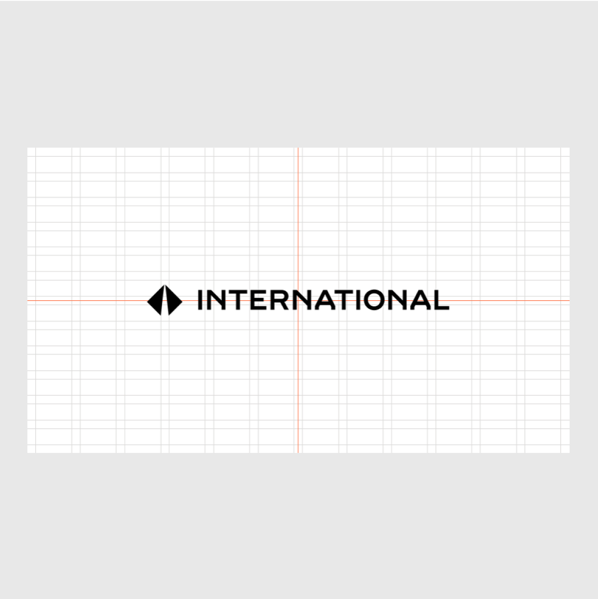
The lockup animation can be placed on full-bleed color backgrounds as well as moving imagery.
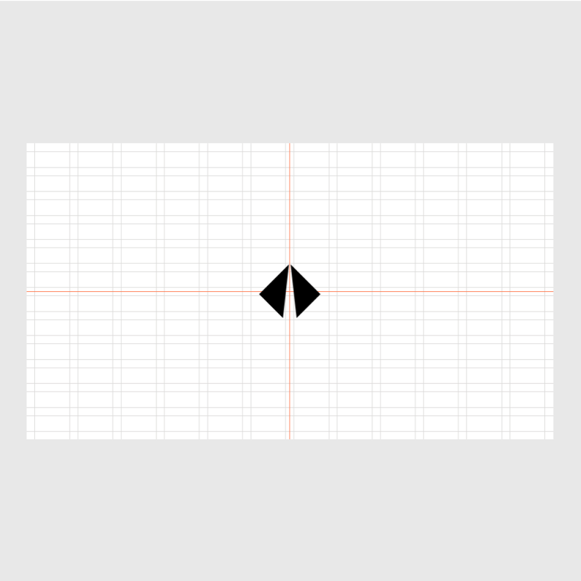
The symbol animation is a secondary device to communicate the sender of the film. It can be placed on full-bleed color backgrounds as well as moving imagery.
Both the lockup and the symbol should be scaled appropriately to maintain clarity and visual balance. In animations, we deviate from the standard guidelines to achieve maximum clarity and impact of the lockup and symbol in a motion context.
The recommended width of the lockup in animations is 50-100% of the format's shortest side, and for the symbol it is 20-40% of the format's shortest side.
The lockup or symbol should always be centered on the canvas, both vertically and horizontally.
Lockup
Symbol
Below are indicative visual examples of how to use the motion principles. These examples should be used as inspiration, informing both employees and partner agencies how to use the brand identity. While these assets show best practice, they may not accurately represent how specific applications look in reality.