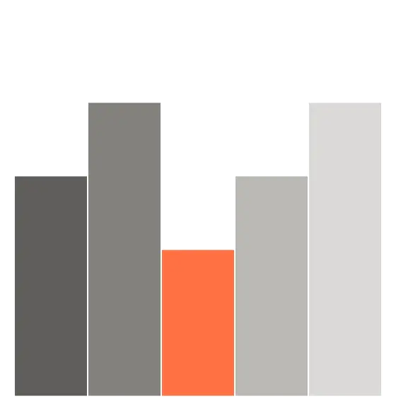
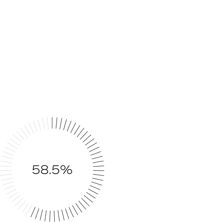
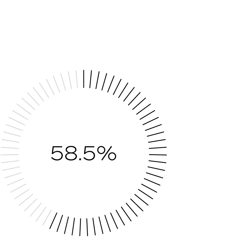
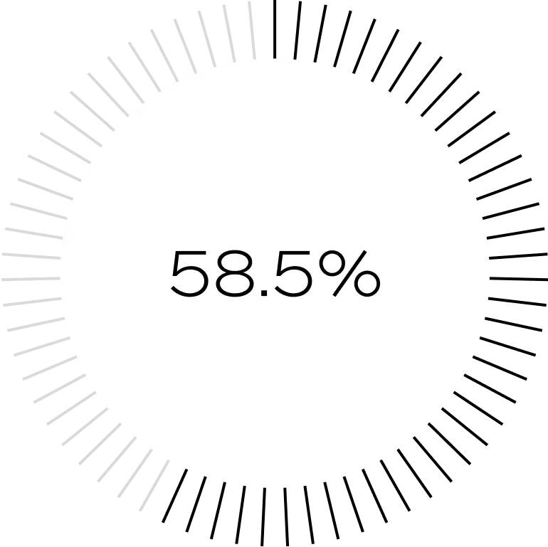
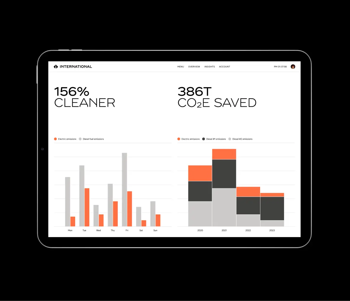
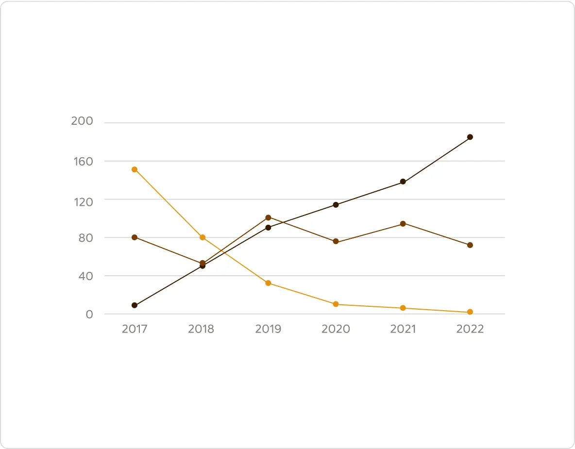
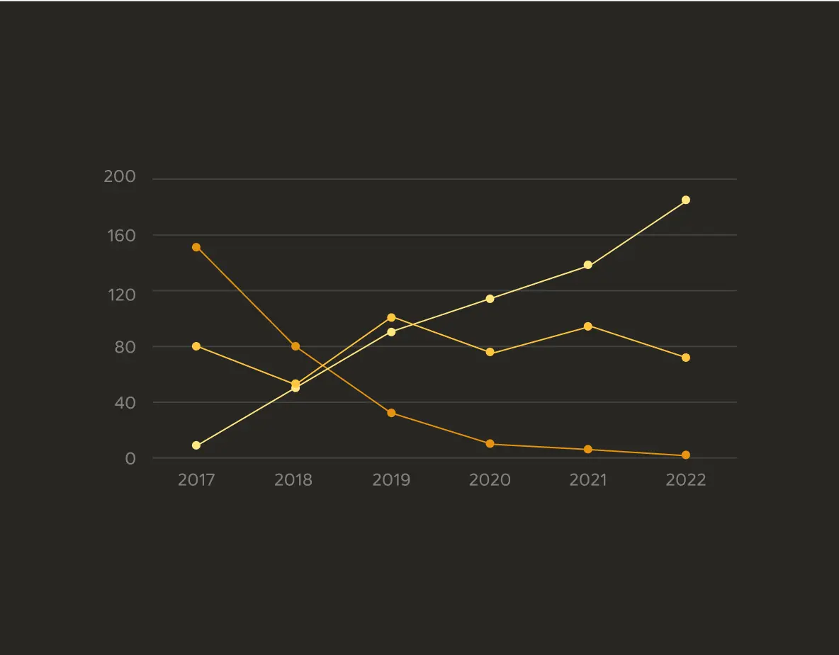
Data visualization is crucial for our brand communication, transforming complex data into meaningful stories. Beyond being functional and clear, our visualizations align with our brand identity, making data and statistics powerful carriers of our brand.
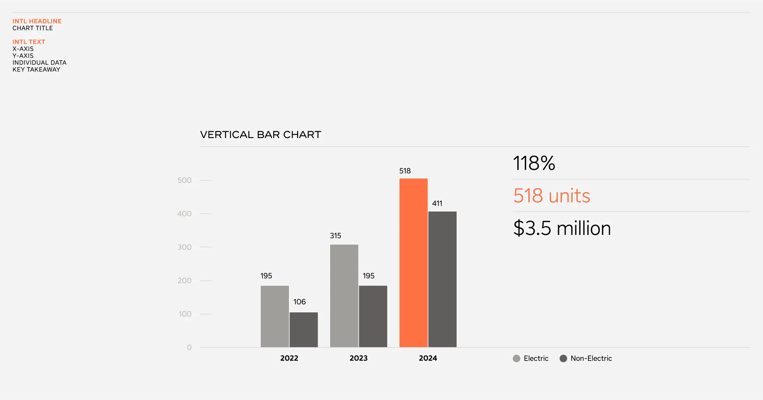
When designing tables, use only the necessary lines and center the text vertically. Ensure the space between each line and text is 1.5 times the cap height. Maintain consistent line thickness with other elements in the same application. Use the INTL Text font in Regular and Bold weights.
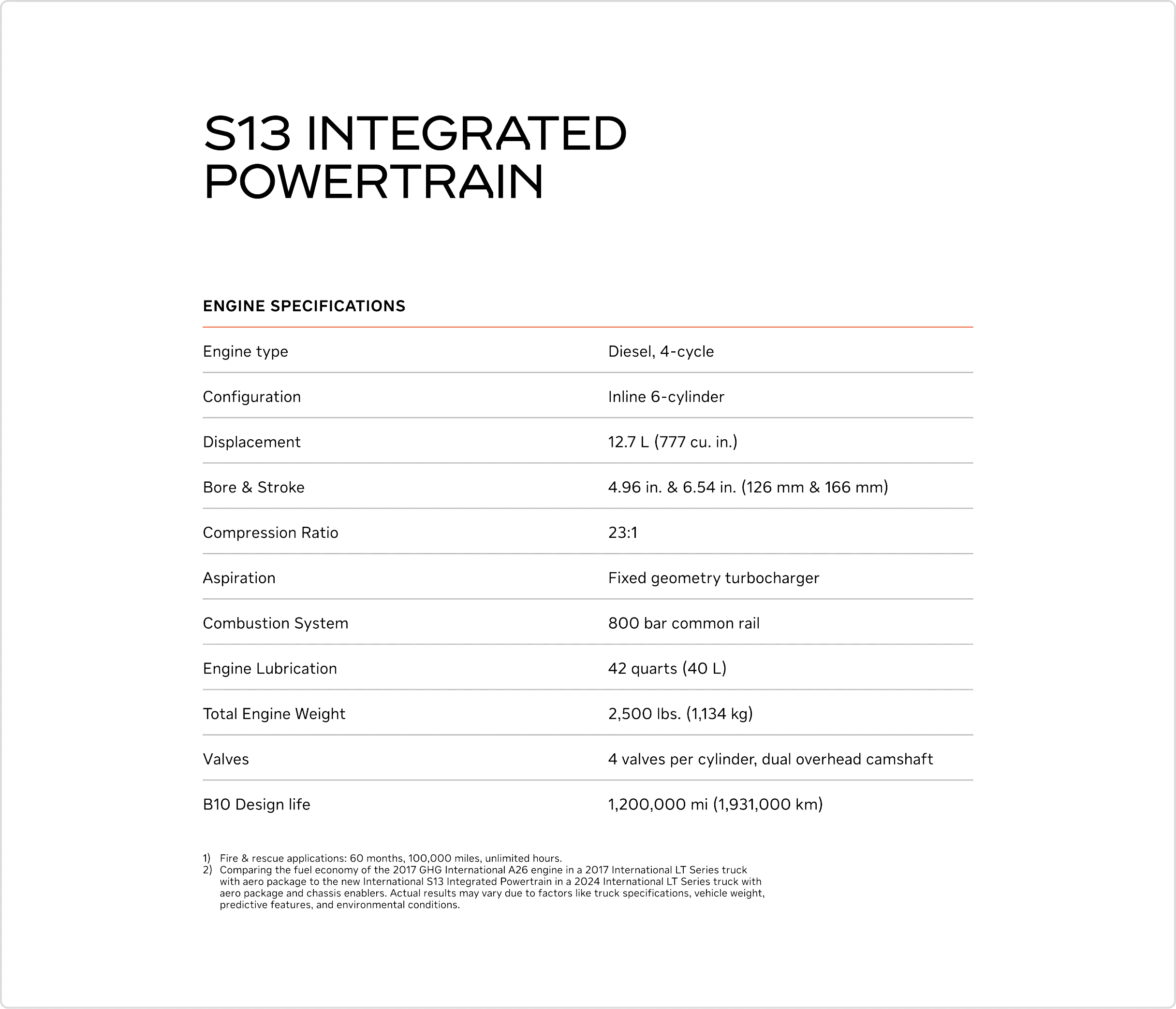
White base
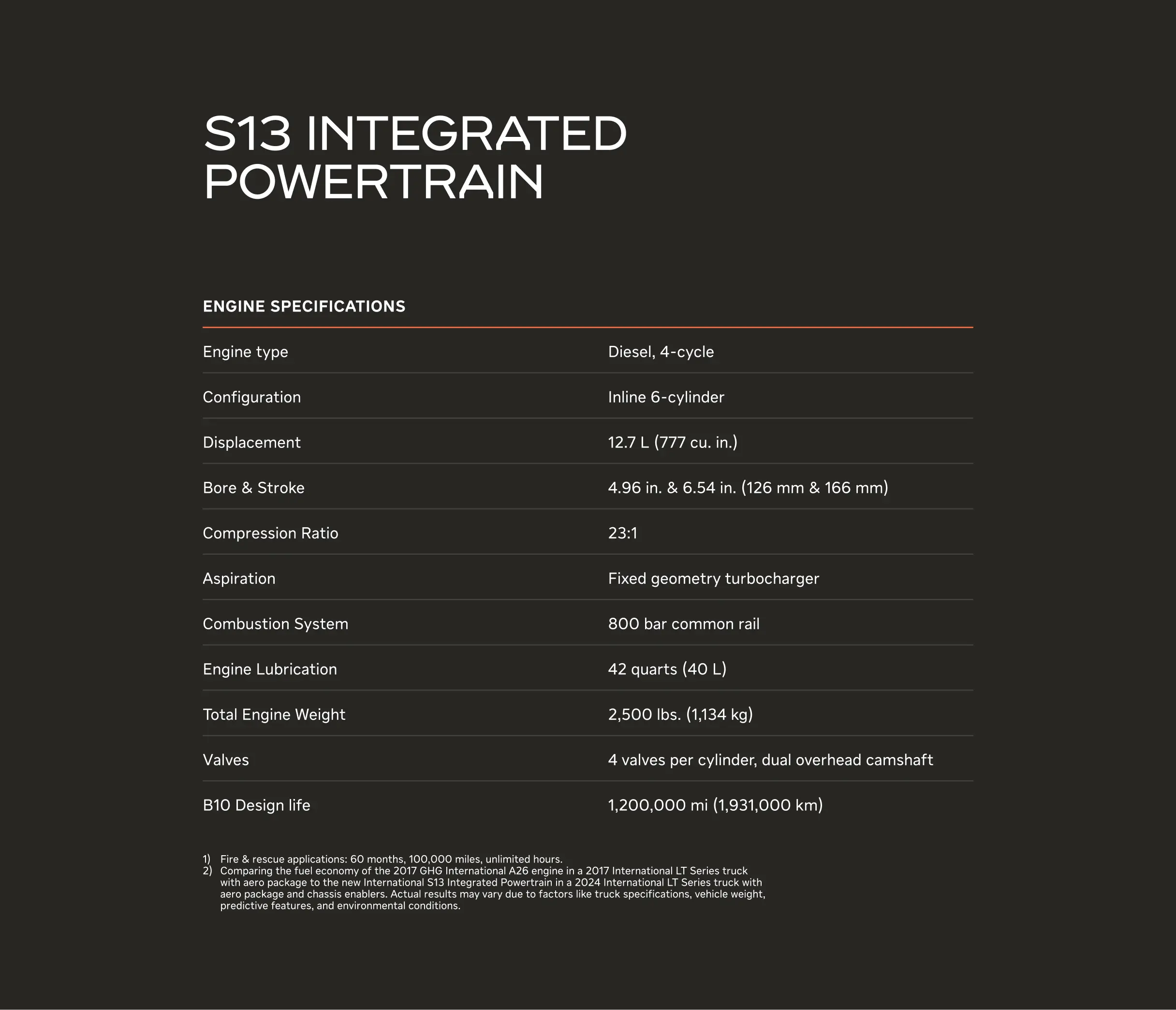
Asphalt Black base
Our expression relies on basic geometric forms: the square, circle and line. This allows us to design in a way that is clear and easily understandable.
Donut chart
Treemap chart

Histogram
Bubble chart
Line graph
Area chart
Bullet graph
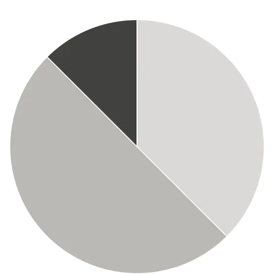
Pie chart
Map route
Increment gauge
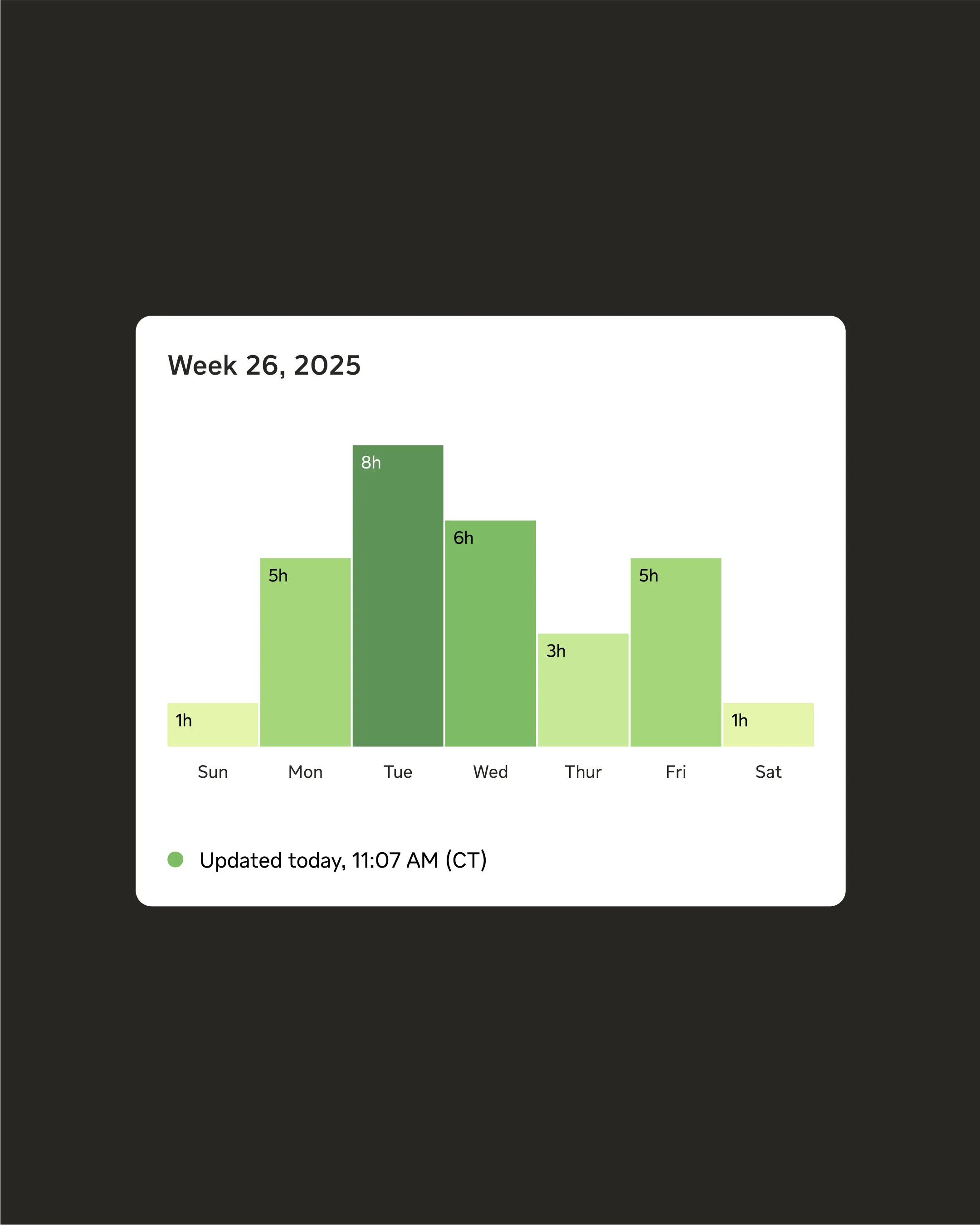
Bar chart
Circular gauge
Like roads connecting A to B, our data visualizations use a linear foundation. The line serves as both a foundational framework and a key element, creating a clear and consistent visual journey across all our data visualizations.
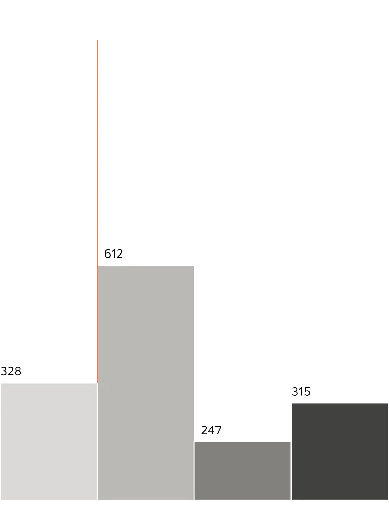
Line as framework
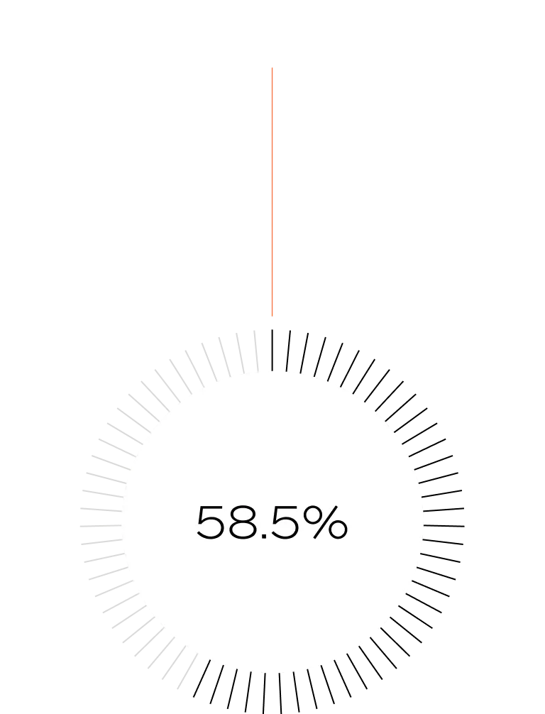
Line as key element
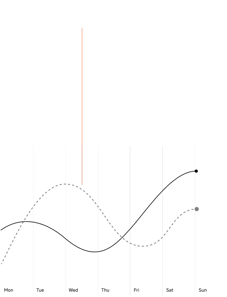
Line as graph
Lines should always be perceived as thin and precise. However, adjustments can be made depending on size and context. A good starting point for line weight is 0.5 pt for print and 1 px for digital. These values ensure that lines are visible yet subtle, maintaining a balance between subtlety and visibility.
When scaling line weights, use increments of one pixel in digital and 0.5 pt in print. This ensures pixels aren’t displaced and maintains a relationship between different lines used in the same application.
Small: 1 px
Medium: 2 px
Large: 3 px
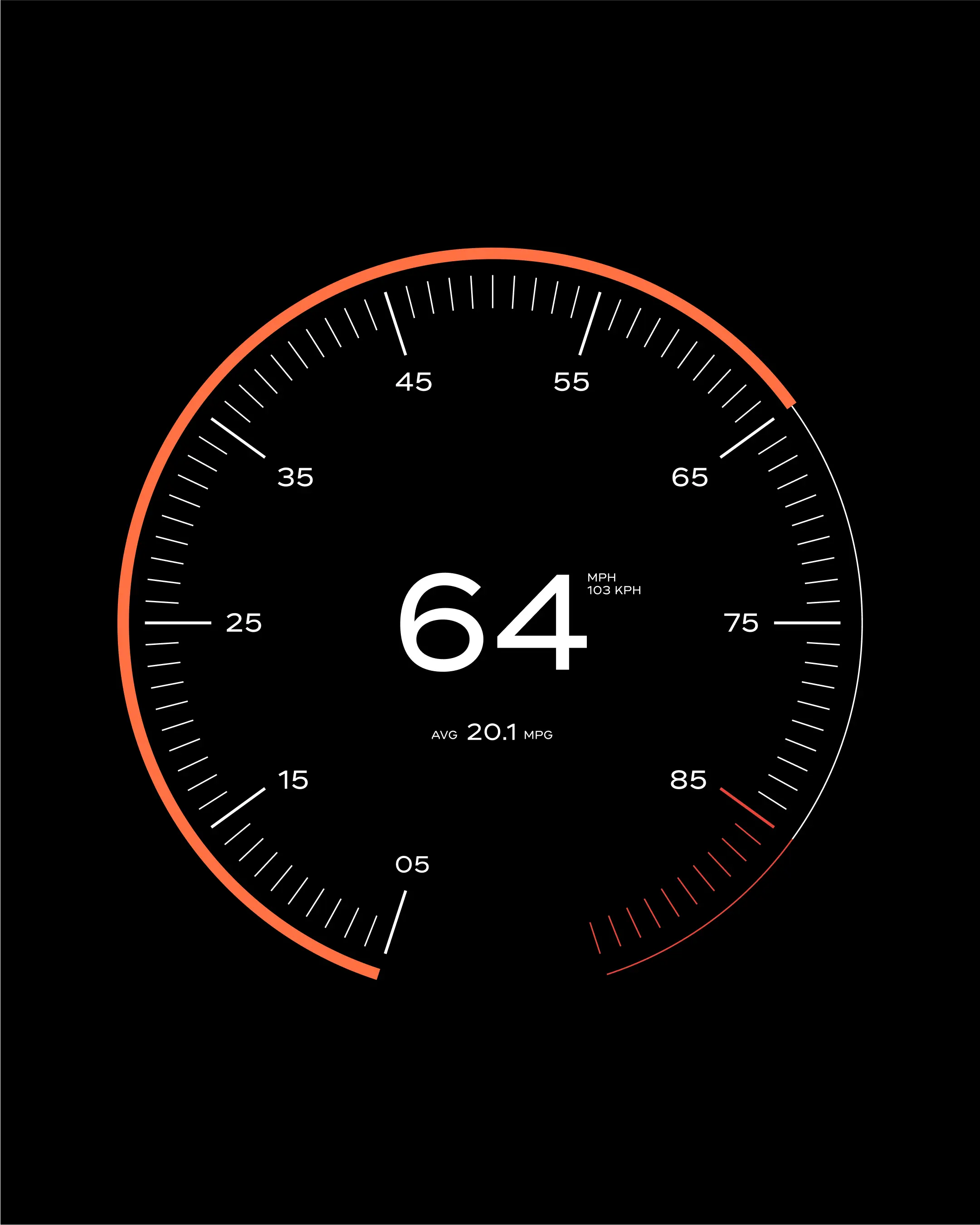
To determine the weight of a line, consider where it’s being used. A linear infographic on an in-vehicle screen may need thicker lines for clarity, while supporting lines, used as dividers or for callouts, benefit from being thin and subtle.
Regardless of the context, avoid making lines too dominant or heavy. To ensure consistency and coherence across an application, keep the number of line weights used to a minimum.
In-vehicle dashboard example
Presentation example
Our core expression utilizes our grayscale, with the International Orange being used for callouts. Below are examples of infographics using this set of colors, demonstrating how they can work on both white and Asphalt Black backgrounds.

White base: Gray 100/300/500/700/Orange

Asphalt Black base: Gray 700/500/300/100/Orange
When adding typography to our infographics or data visualizations, we aim to use a minimal number of typographic sizes. Emphasis is achieved through variations in typographic weights and colors, rather than relying on size alone.
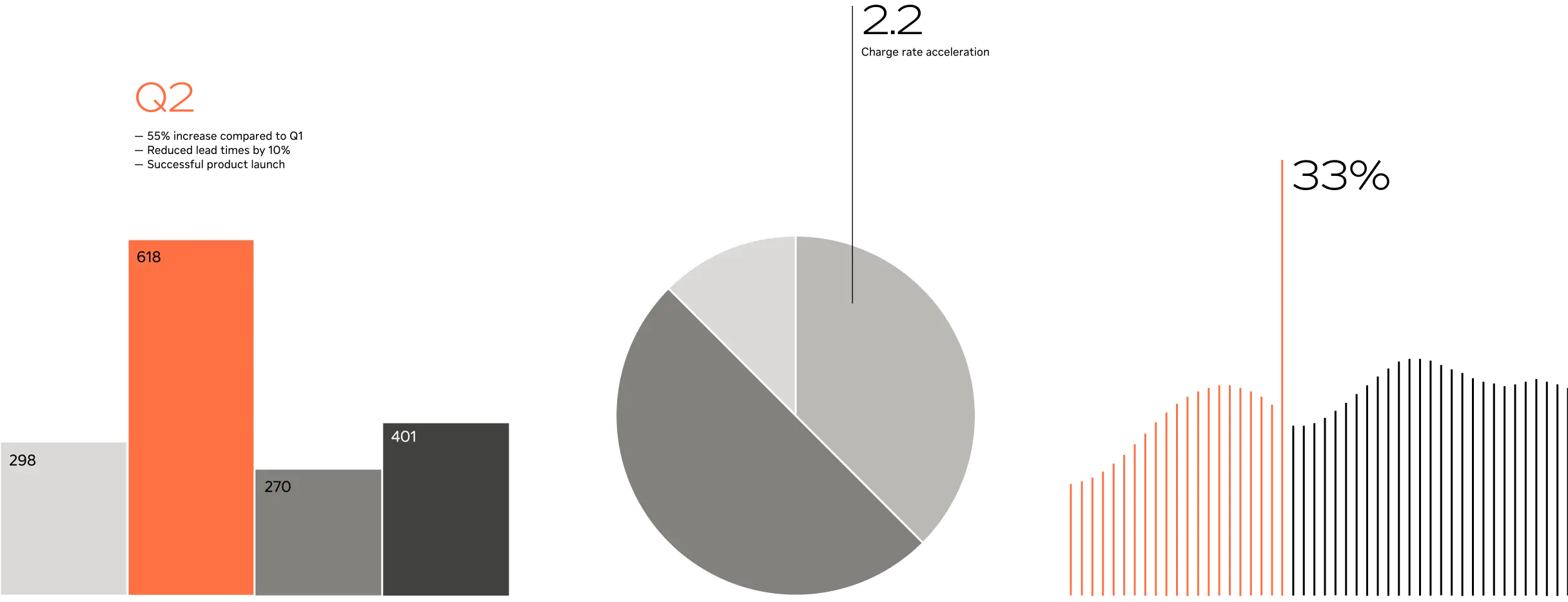
A subtle yet effective way to highlight key information without overshadowing surrounding visuals is by incorporating a simple line.
Similarly, International Orange can be used to draw attention to specific data points. This vibrant hue is especially effective when combined with grays.
Callout examples
Projected data and statistics can be highlighted by applying a repeated stroke. This technique can be used across various infographics to depict subjects such as profitability, efficiency, carbon footprint and more.
Forecast examples
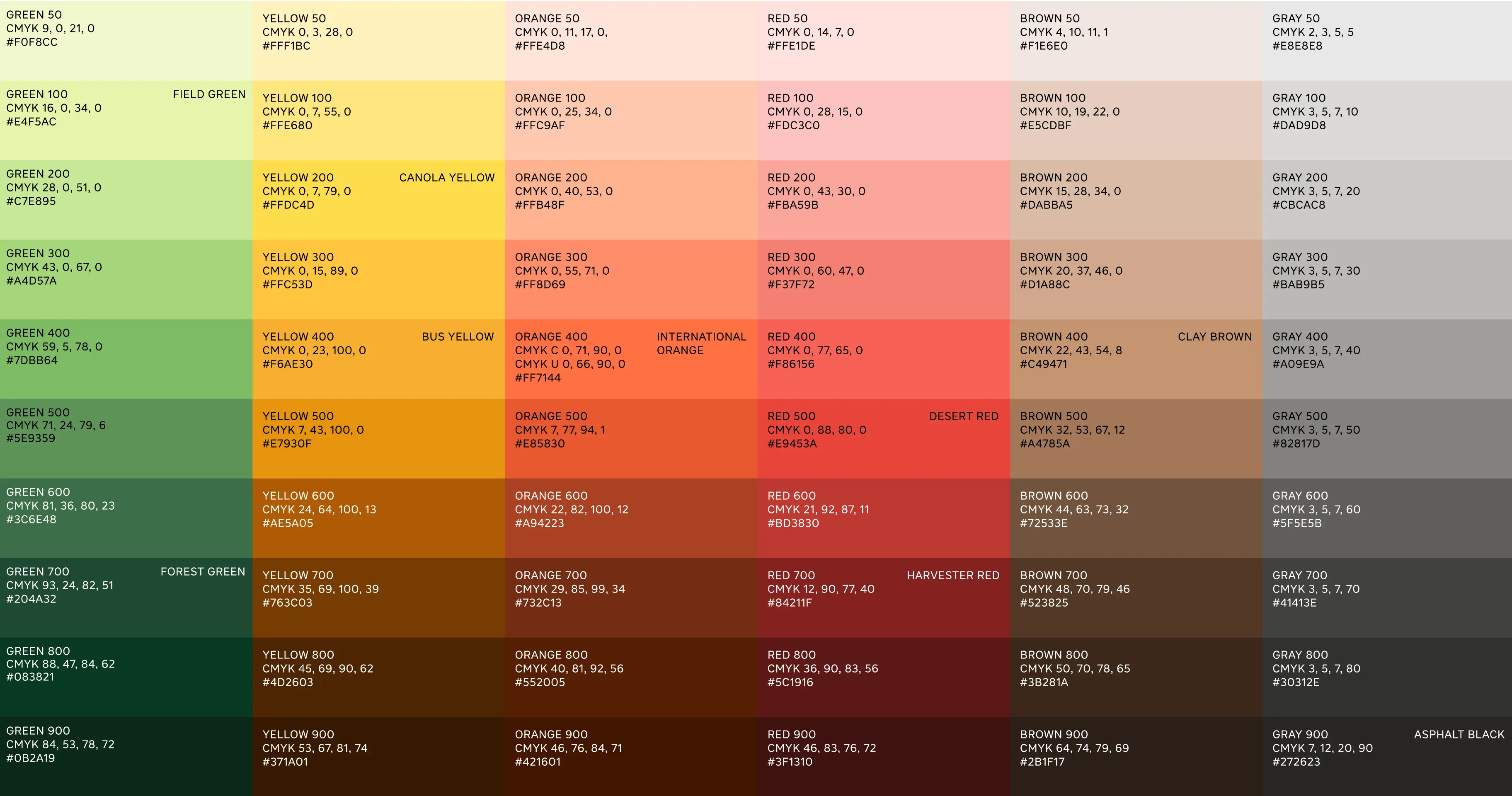
The extended palette is specifically tailored for data visualization and infographics, including expanded tonal ranges of each individual brand color.
Use the extended palette when you have a high number of data points and need a broader range of colors, or when you want to create thematic consistency with other colors used in the same application.
When selecting colors from the extended palette, ensure they provide sufficient contrast with the background they are placed on. Below are examples of values that provide this contrast, showcased on both white and Asphalt Black backgrounds.
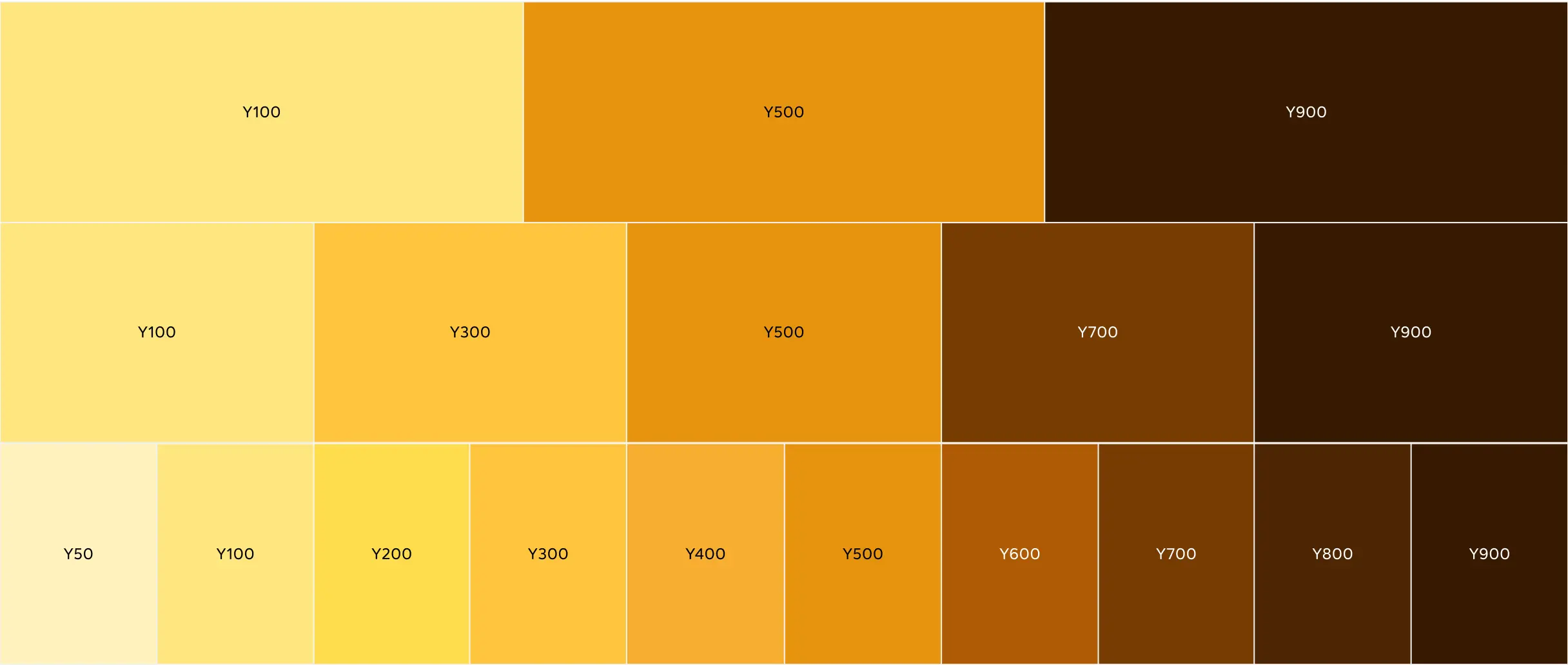
White base: Yellow 100/300/500/700/900
Asphalt Black base: yellow 700/500/300/100/50
When adding color to infographics, we prioritize clarity and impact. We ensure enough contrast between sequential colors, typically using sequences of three, five or nine colors based on the number of data points.
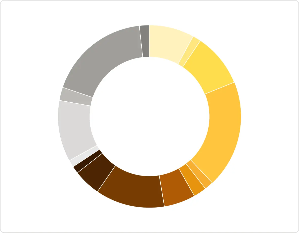
When the tonal range of the selected color no longer provides enough options for representing data points, we integrate our grayscale into the infographic, ensuring sufficient visual contrast with the previously used color.
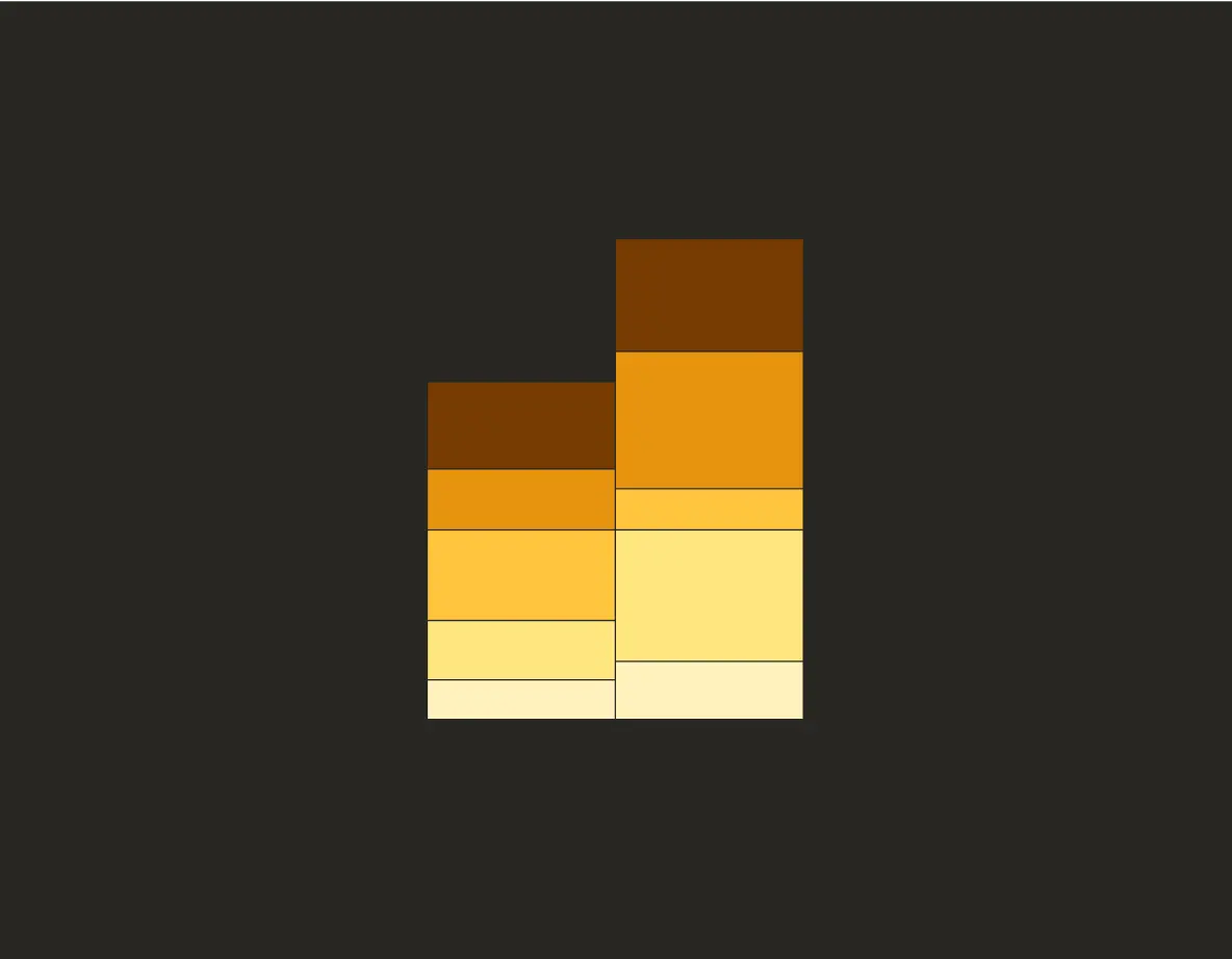
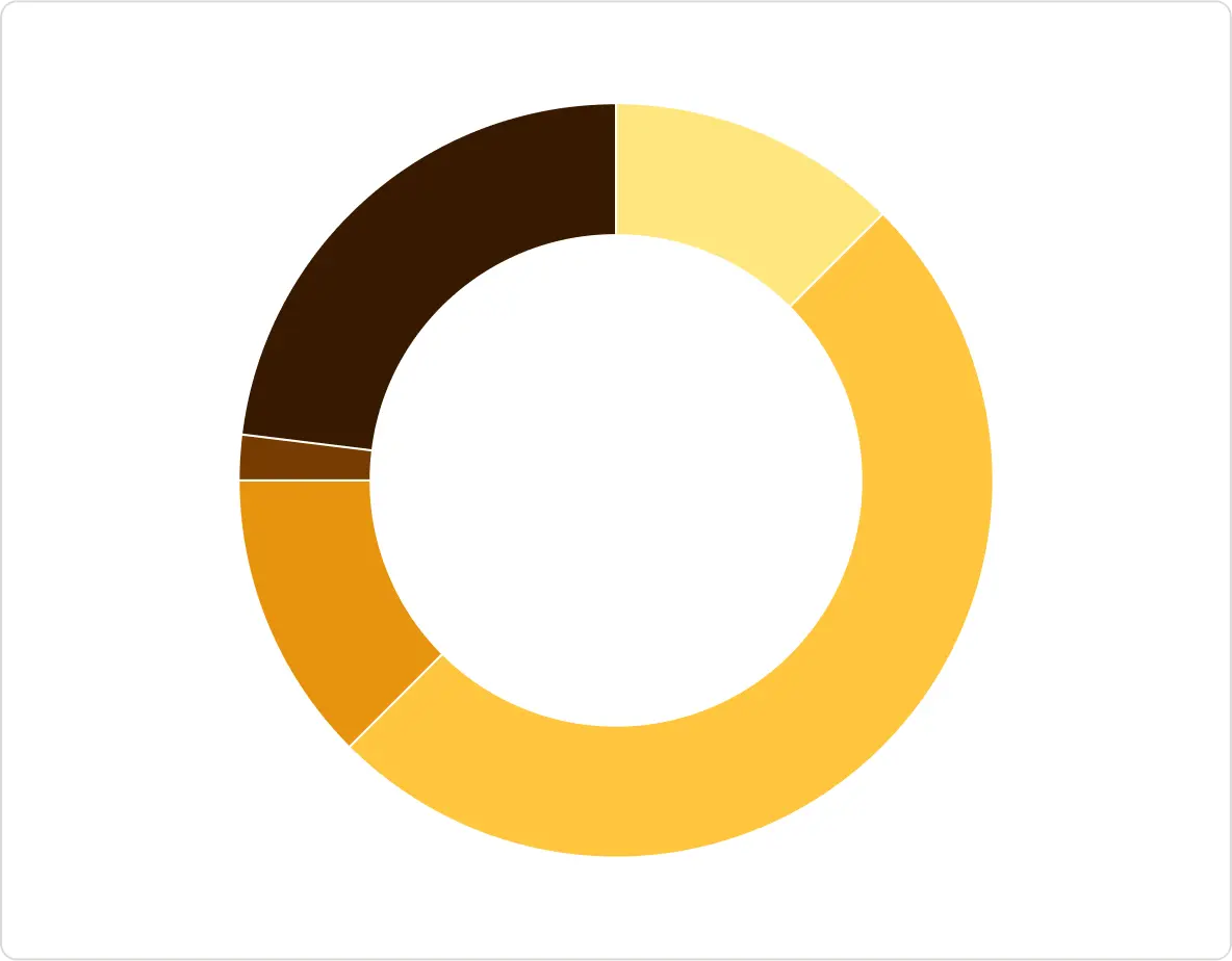
5 data points: Yellow
15 data points: Yellow/Gray
When the tonal range of the selected color no longer provides enough options for representing data points, we integrate our grayscale into the infographic, ensuring sufficient visual contrast with the previously used color.
Yellow 900/700/500 Gray 500/100
Yellow 500/300/100 Gray 500/700
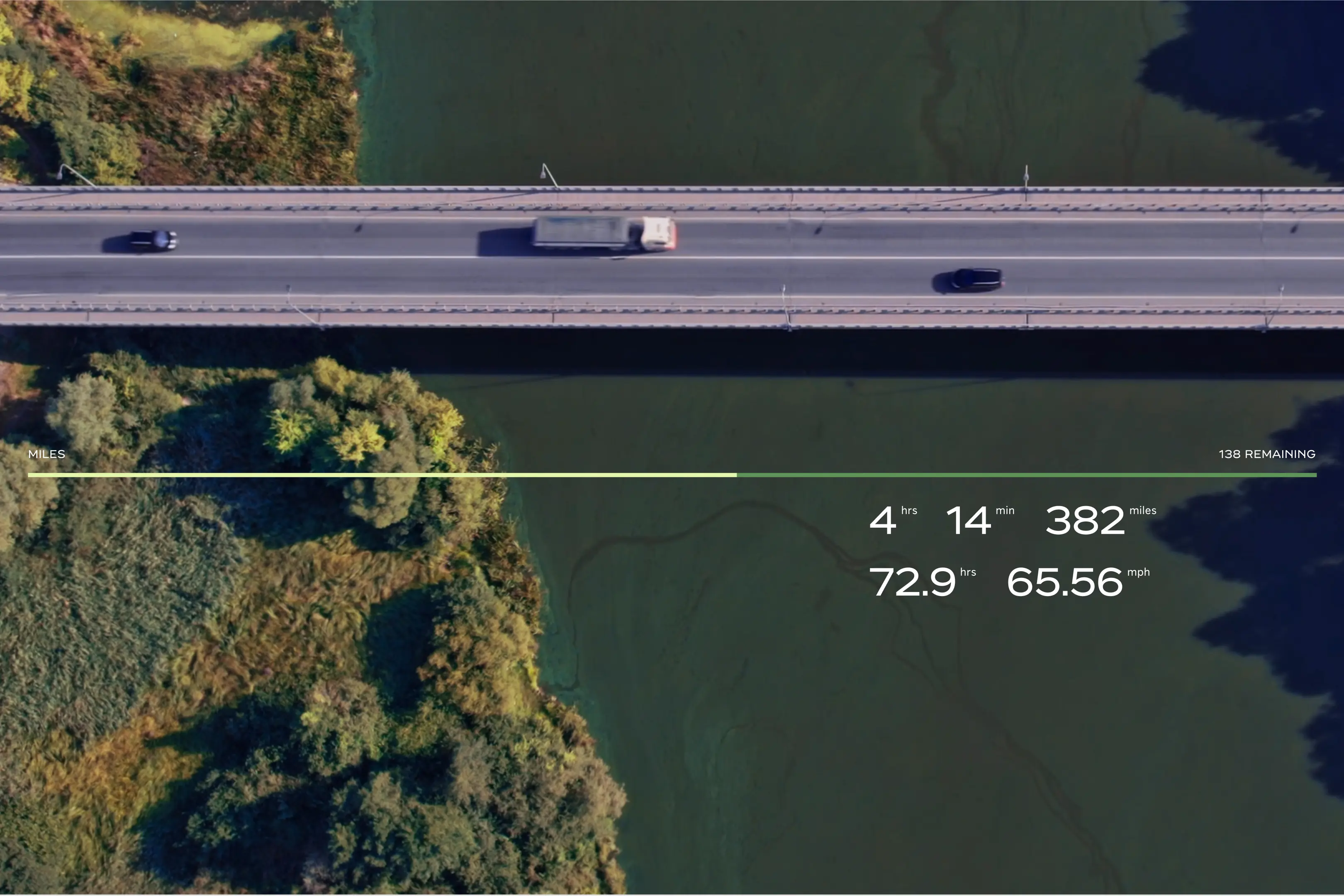
Graphic overlays enhance both the imagery they are placed on and the data. They are a powerful tool for visualizing connected technology, highlighting inner workings and showcasing performance. By using overlays, we can go beyond merely communicating statistics to enhancing the user experience and elevating the International brand expression.
Elevate Graphic overlays should serve a purpose, enhancing the content rather than just acting as decoration. They should be simple, easily understood and add to the understanding of the image or data.
Align stylistically Overlays must be stylistically aligned with our other types of data visualization, as outlined in the previous chapter. This ensures a cohesive visual language across all our data visualizations.
Ensure legibility Maintain legibility by avoiding clutter and using contrasting colors. Place data strategically in calmer areas of the image to enhance legibility and ensure the information stands out clearly.
To ensure legibility, use black text for light background images or white text for dark background images.
Light background image
Dark background image
When selecting supporting colors, aim for a high contrast ratio between the graphic and background to increase legibility. Always accompany the graphic with text to provide context and ensure clarity.
White/Green 300
White/Yellow 200/Green 400
Utilize clearspace in an image and strive to place text or data on a homogeneous part of the photo. On busy backgrounds, use the Bold and Medium weights to add emphasis and ensure legibility.
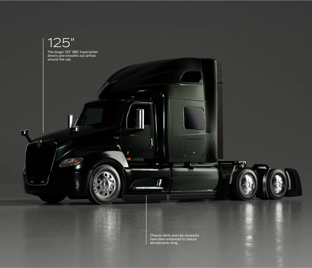
Utilizing image clearspace
Utilizing Bold/Medium weights
A feather gradient set to the multiplied blend mode can be added to improve contrast and ensure legibility. When doing so, make sure not to obscure any key features of the image.
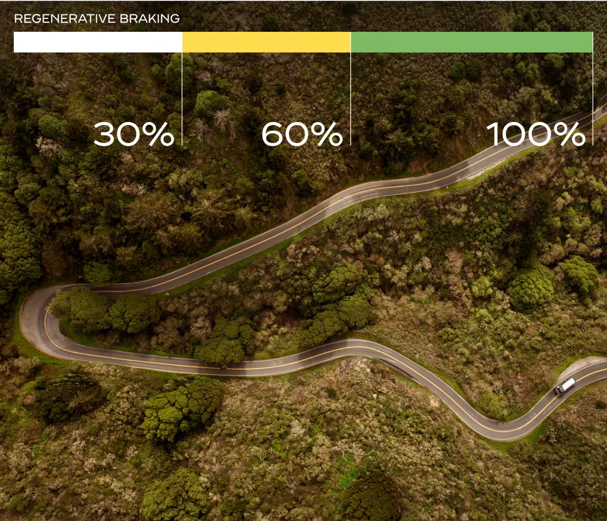
Feather gradient + image
In context with gradient applied
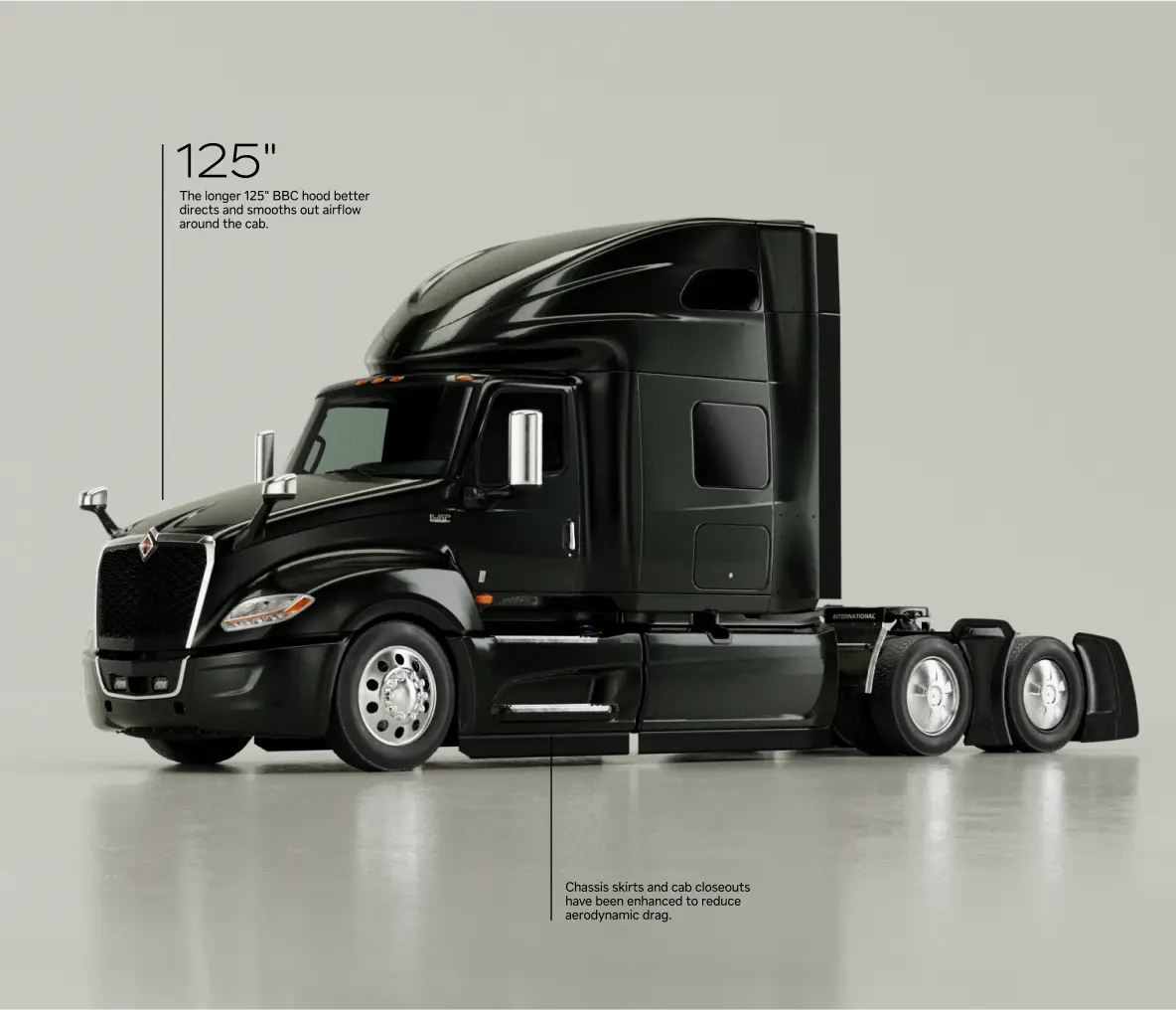
In our graphic overlays, lines are often straight and angular, providing a clean and structured look. However, lines can also be used more freely, such as in line drawings to illustrate concepts like aero-dynamics and air flow around a truck.
This flexibility allows us to be both precise and illustrative, depending on the need.
Motion can elevate our graphic overlays to the next level. By animating over still imagery or moving footage, we can enhance the content by bringing our data to life while simultaneously improving the user experience.
Example 1. Frame 1
Example 1. Frame 2
Example 1. Frame 3
Example 2. Frame 1
Example 2. Frame 2
Example 2. Frame 3
Below are indicative examples of how to use infographics and visualize data. These examples should be used as inspiration, informing both employees and partner agencies how to use the brand identity. While these images show best practice, they may not accurately represent how specific applications look in reality.